OVERVIEW OF THE LOGOTYPE AND ITS VERSIONS


Company logotype is always crucial to success in marketing, because it makes a powerful statement about the corporate style and the very character of the company. It is prominently displayed on all letterheads and documents, whether printed or digital content, and on company products. Kronus trademark consists of the company name, its graphic symbol, and the company slogan. Below are all of the logotype versions in downloadable formats.

Monochrome White With Slogan


PNG 

Logo-Monochrome-Slogan-White

Monochrome Dark With Slogan


PNG | JPG | EPS (CMYK) | EPS (PANTONE)

Logo-Monochrome-Slogan-Dark

Multicolor With Slogan


PNG | JPG | EPS (CMYK) | EPS (PANTONE)

Logo-Color-Slogan

Monochrome Dark Without Slogan


PNG | JPG | EPS (CMYK) | EPS (PANTONE)

Logo-Monochrome-No-Slogan-Dark

Monochrome White Without Slogan


PNG

Logo-Monochrome-No-Slogan-White

Multicolor Without Slogan


PNG | JPG | EPS (CMYK) | EPS (PANTONE)

Logo-Color-No-Slogan

Monochrome White Without Slogan And Symbol


PNG 

Logo-Only-Name-White

Monochrome Dark Without Slogan And Symbol


PNG | JPG | EPS (CMYK) | EPS (PANTONE)

Logo-Only-Name-Dark

Monochrome White Only Symbol


PNG

Logo-Monochrome-Only-Symbol-White

Monochrome Dark Only Symbol


PNG | JPG | EPS (CMYK) | EPS (PANTONE)

Logo-Monochrome-Only-Symbol-Dark

Multicolor Only Symbol


PNG | JPG | EPS (CMYK) | EPS (PANTONE)

Logo-Color-Only-Symbol

LOGO ANATOMY WITHIN THE GRID

The company logo is constructed within a particular grid, as displayed in the image below. The unit of one square is used in the grid to define the proportion between elements of the logo. For example, there is a space of one square between the name and the slogan, while the slogan itself is 2/3 squares high.
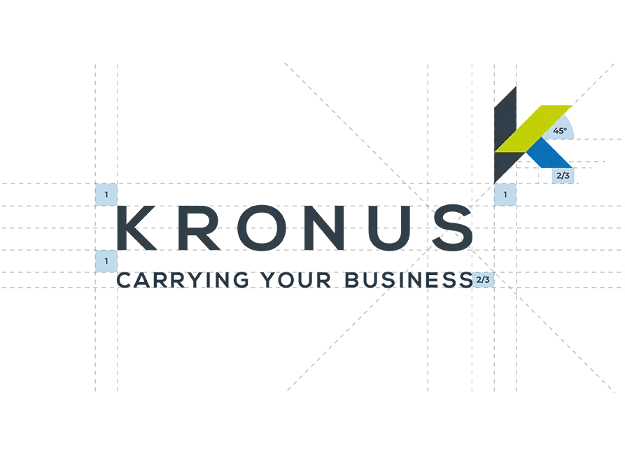
logo-03-grid_1

SAFE ZONE OF THE LOGO

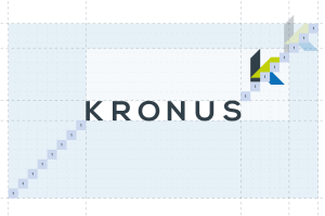
A very critical element of the logo is its safe zone. Safe zone is a reserved space around the logo that prevents other elements from appearing too close to it. For every version, safe zone is measured from the name.

zone-slogan

Safe zone for the logo with the slogan

The reserved space is eight squares or the size of two graphic symbols. The graphic symbol connected to the logo ignores the safe zone.

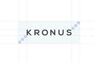
zone-no-slogan

Safe zone for the logo without the slogan

The same as for the full logo, but the slogan is not included.

zone-symbol

Safe zone for
only the logo
symbol

When using only the logo symbol without the name and the slogan, the safe zone is three squares or the size of one graphic symbol.

logo-safezone-only-name

Safe zone for only the company name

The same as for the graphic symbol: three squares or the size of one graphic symbol.


MINIMUM SIZE OF THE LOGO AND POSITIONING LIMITATIONS

For each version of the logo, corporate style specifies the minimum size at which the logo is still clearly readable. The minimum size ensures consistency and makes the logo clearly visible. It also helps to choose the best version to serve a particular purpose.

size-full

32 MM

Minimal size of logo with the slogan

size-no-slogan

28 MM

Minimal size of logo without the slogan

size-no-symbol

15 MM

Minimal size of logo without the slogan and the symbol

size-symbol

5 MM

Minimal size of logo symbol


LOGO POSITIONING

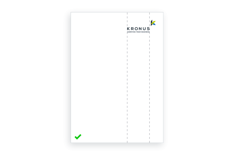
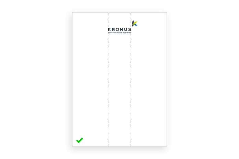
There are certain rules regarding positioning the Kronus logo. The only two valid options are either upper centered or upper right alignment. In both cases, the graphical symbol is ignored – the logo and all other elements align by the end of the letter S.

logo-position-03

UPPER RIGHT

The logo sits in the upper right corner on most printed materials, online content, corporate promo gifts, etc.

logo-position-02

CENTERED

In some rare cases, when there is little content other than the logo, it aligns centered.

logo-position-01

EXAMPLES OF INCORRECT POSITIONING

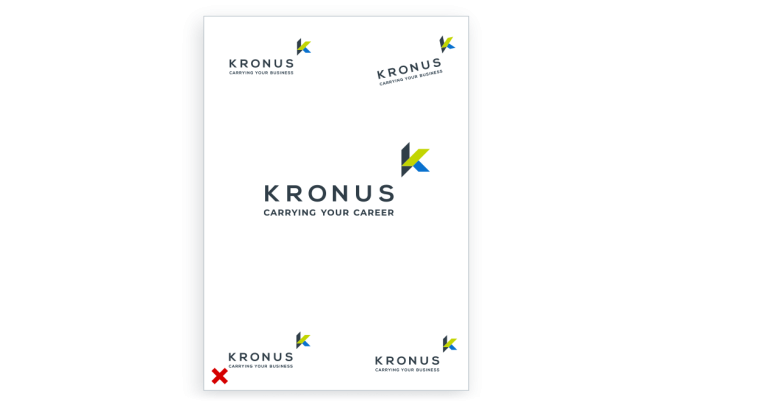
Any other positioning other than upper right or centered should be avoided. The image displays several examples of unacceptable logo positioning. The primary rules when positioning the Kronus logo are as follows:

  • Never rotate the trademark;
  • Never position the logo in any corner other than the upper right corner;
  • If centered, the logo should still be at the top;
  • Preserve the correct scale when positioning the logo.


USAGE OF LOGO ON DIFFERENT BACKGROUNDS

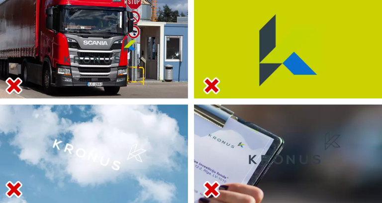
Using photo backgrounds helps to convey a clear message without resorting to writing a particular text. But we must always keep in mind that the logo should be used correctly. Below are some examples of correct and incorrect usage.

logo-07-acceptable-usage

ACCEPTABLE LOGO USAGE

Make sure to keep the appropriate contrast between the logo and the background photo. It is advisable to use white logo on darker backgrounds, and dark logo on lighter ones. If the photo has a flat light spot, then a colored logo must be used.

logo-08-unacceptable-usage_1

UNACCEPTABLE LOGO USAGE

Avoid using colored logo on motley backgrounds. Do not rotate the logo. Avoid using photos with colors that mix and / or blur with the logo.


THE COMPANY SLOGAN AND ITS VARIATIONS

banner-mockup

CARRYING YOUR BUSINESS

Kronus slogan “Carrying your business” is effectively a play on words. Kronus metaphorically carries forward its clients’ business, solving their logistics and packaging problems, while Kronus’ pallets literally and physically carry clients’ goods around the world.

logo-slogan-variations-02

SLOGAN VARIATIONS

Kronus’ slogan may change on different occasions, suggesting that something other than business can be carried forward. The last word of the slogan may change, yet the opening words “carrying your…” must always be there.